
Welcome to kaanugrasiz.com
How do brands think; how do people make decisions?
What happens at the intersection of marketing, design, technology, and everyday life? On the #BrandMonday blog, I try to understand how brands think, how people make decisions, and how communication takes shape.
Sometimes it’s a campaign, sometimes a habit, and sometimes it’s the answers I seek to the small contradictions of modern life.
Grab a coffee and come along; let’s think about the topics you’re curious about together.
Meet to Beauregard
When thinking about menswear; quality, durability and timelessness are concepts embraced only by certain brands. Beauregard is a vision of an innovative apparel brand targeting men who have their own definition of style and a dynamic lifestyle.


Kaan Ugrasiz
Transforming brands through strategic content and authentic storytelling
Bridging brand vision and audience engagement with AI-supported, human-centered content that cuts through the noise, converts and creates lasting impact
In-scene advertising: Integrating advertisements into the flow of the story

Imperfect Perfection: The new language of intimacy

Job hugging: embracing your job or fearing losing it?

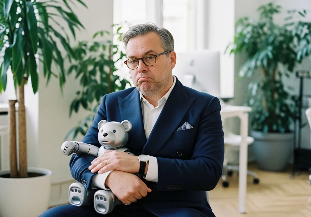
If AI replaces workforce who sustains the economy?

What do you gain or lose by falling in love with an idea?
Why should companies develop and support returnship programs?

Featured Works
Case studies demonstrating content strategy and brand communication excellence


Blog
Weekly blog post related to ideas, marketing, communication, design and tech.

In-scene advertising: Integrating advertisements into the flow of the story

Imperfect Perfection: The new language of intimacy

Job hugging: embracing your job or fearing losing it?

If AI replaces workforce who sustains the economy?

What do you gain or lose by falling in love with an idea?